3 mistakes to avoid in your food packaging
The food packaging industry is a hotbed of creativity and innovation. And for good reason: designing packaging that stands out in a highly competitive landscape while protecting both its contents and consumer health is no small undertaking. This makes coming up with the ideal packaging for your food and beverage brand a major undertaking - but an exciting one. To ease the process, here are three food packaging mistakes to avoid from the get-go:
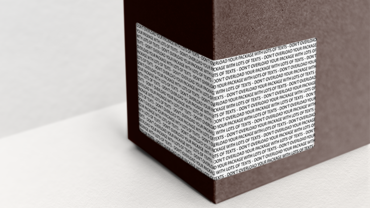
Making your packaging too busy
Whether your brand is minimalist or maximalist, be wary of overloading the front panel of your packaging with text. It’s obviously tempting to provide consumers with as much information as possible about your products’ ingredients, nutritional benefits and sustainability credentials, but be creative about how you do it. Stick to the most important features and find a creative way to direct consumers towards any further info, such as QR codes, extended content labels (ECLs) or even your brand’s social media handles.

Not right-sizing your packaging
Barely a day goes by without major e-commerce platforms getting called out online for shipping compact goods inside almost comically oversized boxes. Not only is this practice environmentally unfriendly, it also puts contents at risk of damage in transit. More specifically to food products, consumers can feel cheated when they open a package to find that it contains less than visually promised. Do your buyers and the environment a favour, and make sure your packaging fits its contents.
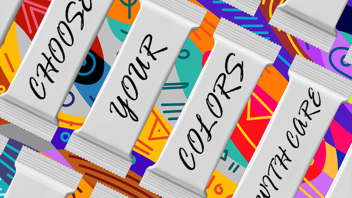
Not aligning flavours and colours
It’s tempting to go with the flow when it comes to packaging trends - summer, for example, generally means bold, vibrant shades, while we tend to see a lot of forest green around winter holiday time. However, keeping your finger too firmly on the pulse will do you a disservice in the long run: not only will your products struggle to stand out from the similarly-branded competition, you also risk communicating the wrong message about what your product actually tastes like. Carefully analyse your flavour profiles - sweet, spicy, tangy, or savoury - in order to pick the colour scheme that most closely aligns with or complements them. Sharp, minty chewing gum, for example, is best paired with greens and icy blues, while richer aromas lend themselves to deeper, more warm shades.
Nissha Metallizing Solutions offers durable, eye-catching packaging solutions for a wide range of food packaging applications. Our design team would be delighted to help you come up with something that fits your unique needs!