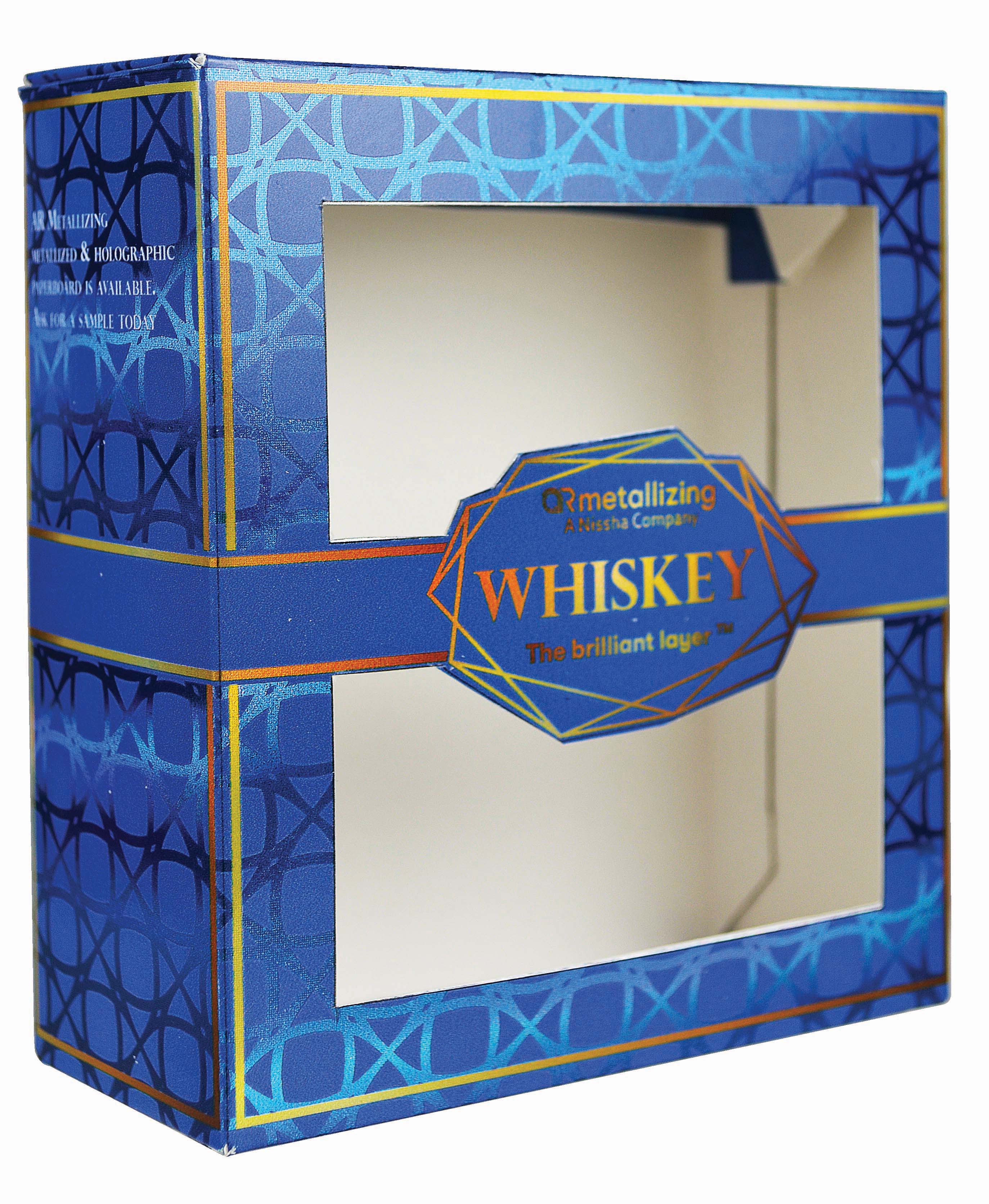
Creating a unique look matte and shiny look using spot white ink
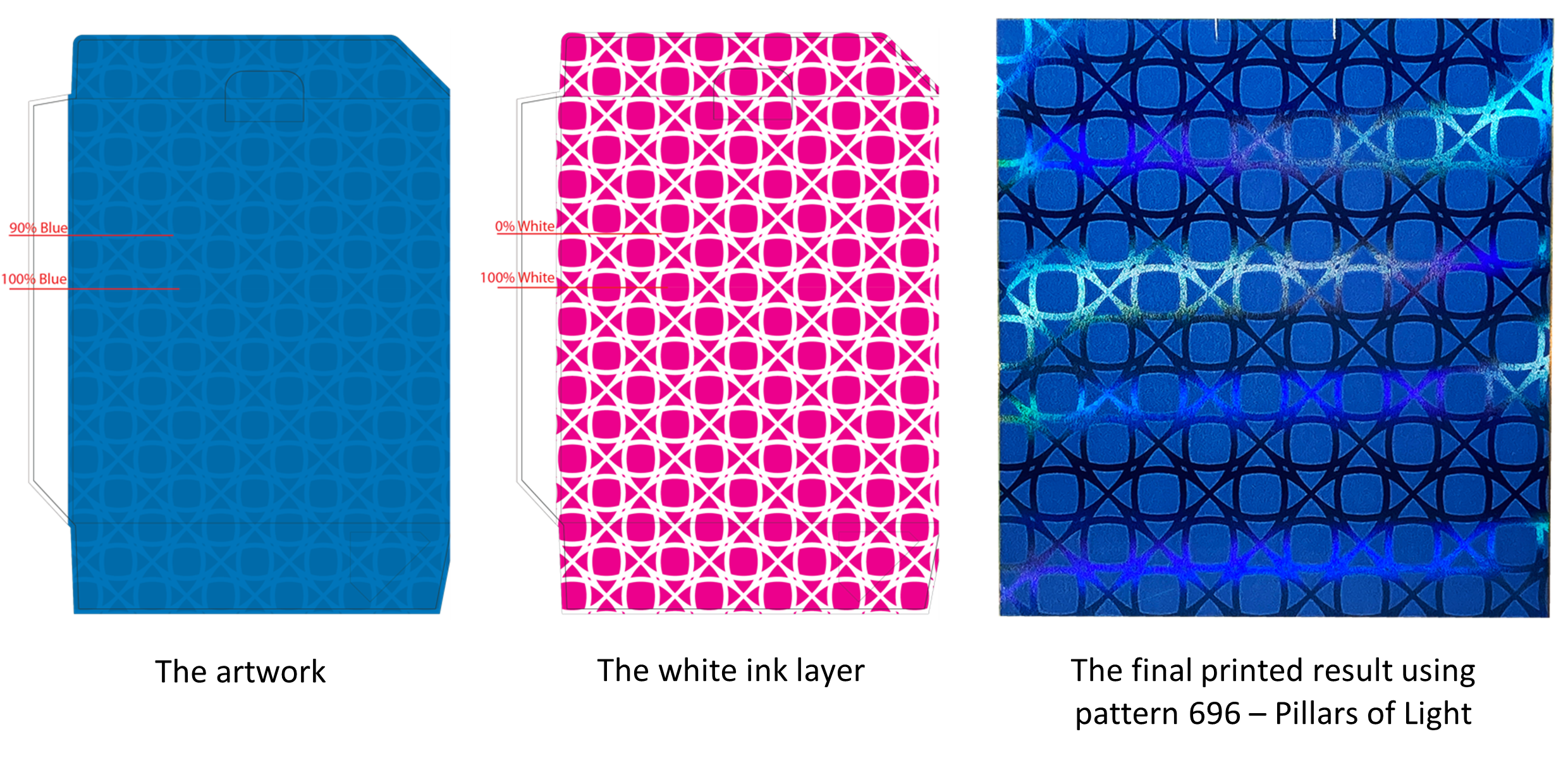
You can create an interesting look using one color and the use of white ink. For this example, the art is 100% blue and the pattern over the art is the same blue at 90%. Duplicate the layer to create the white ink layer. The magenta color that is being used was labeled as spot white. The 100% blue became 100% white to block out the holographic/shiny metallic paper while the pattern created using the 90% blue was changed to the 0% white so the blue ink would be the only coverage over the metallic paper to fully show the power of the paper behind the blue ink. The result is striking! For this example, Pattern 696 – Pillars of Light was used but this also is a great way to use a very busy pattern and make it less busy while still having a lot of movement in the holographic paper.
Do you have a design you would like to see on holographic paper? Email k.suriel@armetallizing.com and she will get working on a prototype for you so you can see what your design would look like on holographic paper.